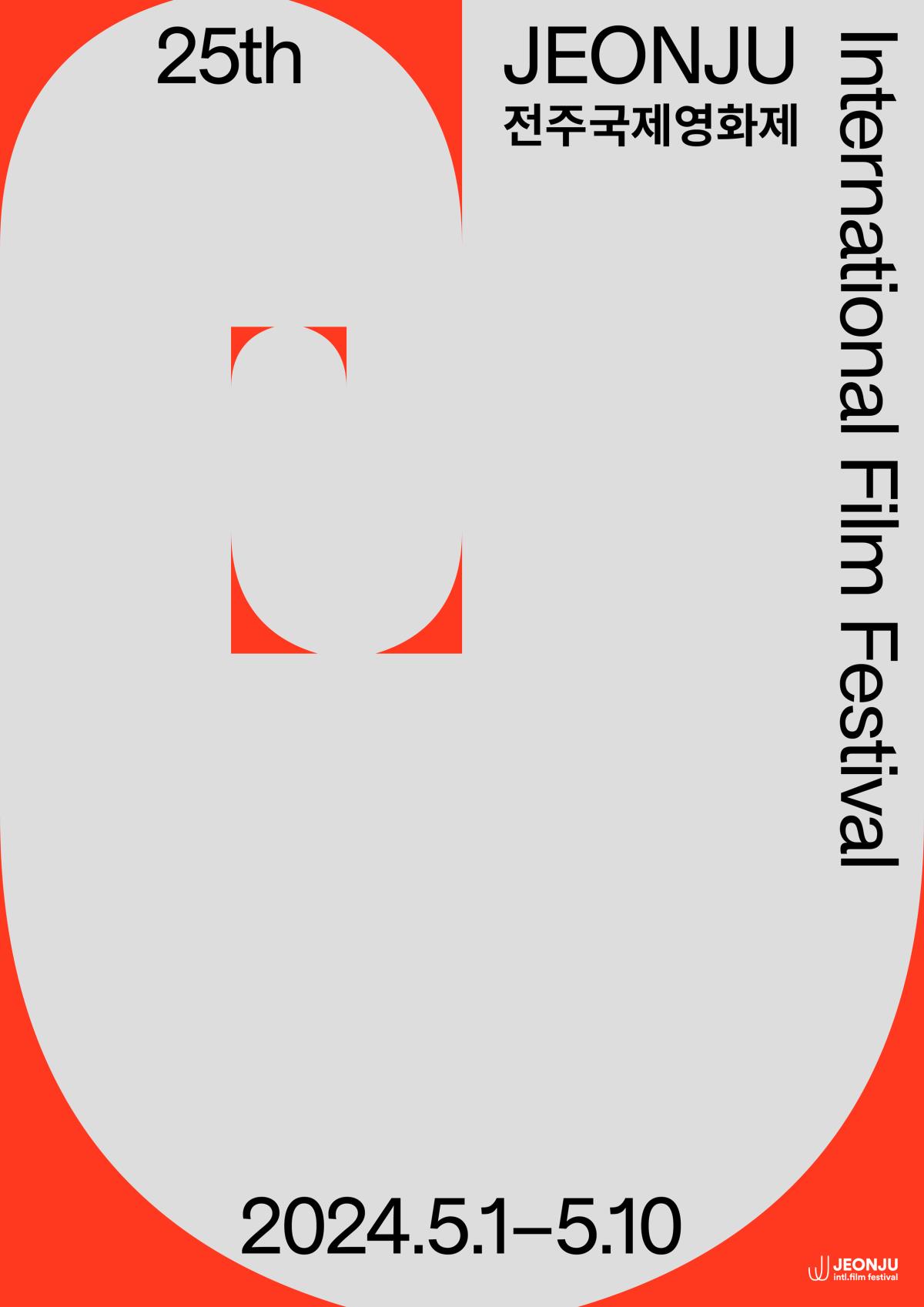
- Spiraling 'J' Motif: Symbolic Identity for Infinite Growth and Expansion
- Cinematic Dynamism Framed, Infinite ‘J’ Showcases Festival’s Visions
The 25th JEONJU International Film Festival (JEONJU IFF, Festival Co-Director MIN Sungwook and JUNG Junho) has released its official poster.

The JEONJU IFF has been developing its identity program every year since 2020, using the initial letter “J” from “Jeonju” as a motif. Following last year's official poster, which symbolized “Challenge, Expansion, and Festival,” this year's official poster was inspired by the spiraling sprout stage of plants, conveying the meaning of infinite growth and expansion.
The official poster for the 25th JEONJU IFF represents the visions of the festival with the infinite J spiral. The rounded corners of the infinite J visually resemble a frame and allude to the art of capturing moving images in cinema. The infinite J was painted in JEONJU Red, the signature color of JEONJU IFF, to emphasize the festival's identity.
This year’s festival identity design was created by Jang Wooseok, Line Arngaard, and Zuzana Kostelanská. The three designers met in 2016 at the Gerrit Rietveld Academie, an art school in Amsterdam, the Netherlands, and have been actively working as graphic designers.
The 25th JEONJU IFF, featuring the unveiled official poster, will be held for 10 days from May 1 (Wed) to May 10 (Fri) in and around Jeonju Film Street.
<Comments from the Art Director: the festival identity of the 25th JEONJU IFF>
JEONJU International Film Festival has been developing its identity program every year, using the initial J of Jeonju as a motif. The 2024 J is an ever-growing infinity symbol, inspired by the spiraling sprout stage of plants. It was created by rotating the counter shape of the letter J around itself until it formed an Infinite J spiral. The rounded corners of the Infinite J visually resemble a frame and allude to the art of capturing and framing moving images in cinema. Moving images and moments like the once JEONJU International Film Festival are made of.
Art Director KIM Tai-hun


